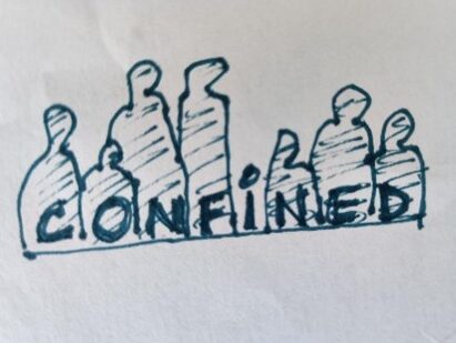
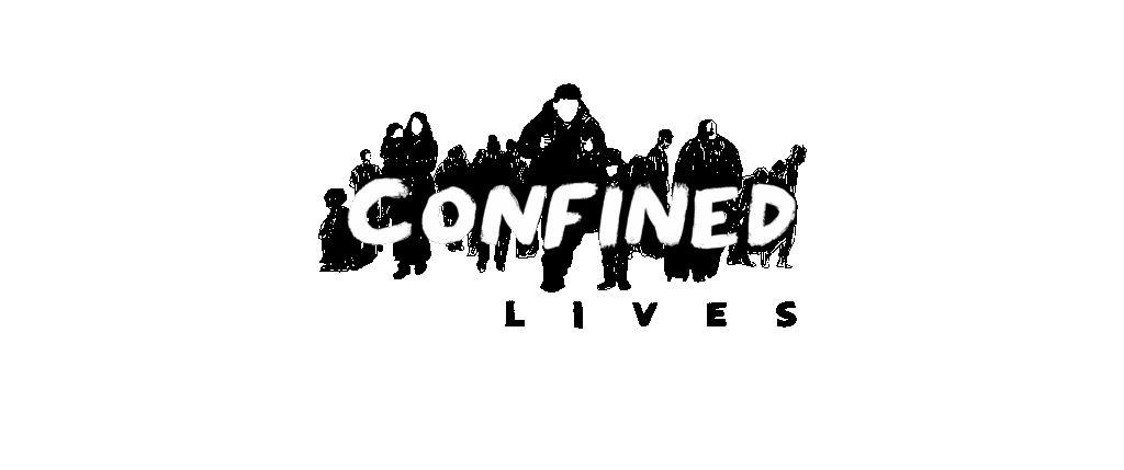
The CONFINED logo is the result of a collaborative discussion in our team on how to visually represent confinement. It is important to us that the logo not be the decision of a single person, but rather the result of dialogue among our researchers.
Our initial inspiration focused on physical barriers—doors, nets, bars, roads, and boxes—as possible motifs to frame the logo. However, members of the team pointed out that our research centers on people, not just material obstacles. They emphasized the need to reflect the human impact of confinement, rather than its structural symbols.
This led to our first sketch of the current logo, featuring shadows cast across the word CONFINED. These shadows suggest the presence of unseen forces acting on people’s lives—an idea central to our project. We wanted the logo to reflect how confinement is experienced, not just how it looks.
The final version was brought to life by illustrator Ada Jusic, who helped us translate these ideas into a cohesive visual identity.
You can see both the first sketch and the final logo below.


